By offering customised, accessible, and personalised service, Ánfora works closely with its customers to help them find the perfect wines for their taste and budget. Whether you are a novice or a connoisseur, their expert guidance will help you taste an exquisite range of labels.

With a fundamental and significant role in wine history, evolution and popularisation, amphoras were responsible for storing, transporting and building the flavour of many wines produced thousands of years ago.
Knowing this and valuing this history, Ánfora Vino sought to revive these facts by taking advantage of this valuable name and becoming the great interlocutor between wine lovers and producers of the best wines in the South American market.
BRIEF
It was essential for Ánfora Vino that its brand identity created a clear connection between past and present and was faithful to the company's values.
It was essential for Ánfora Vino that its brand identity created a clear connection between past and present and was faithful to the company's values.
SOLUTION
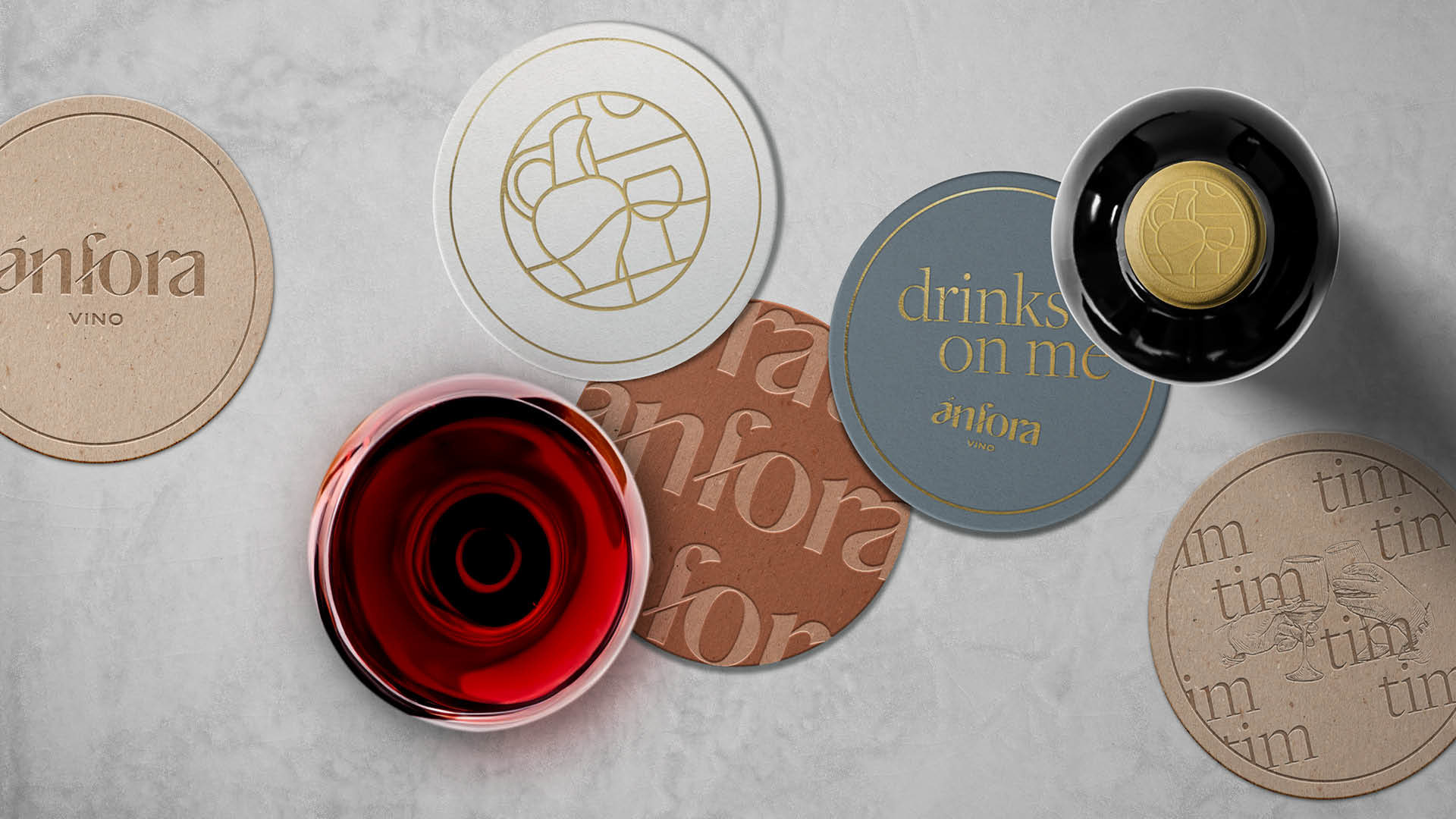
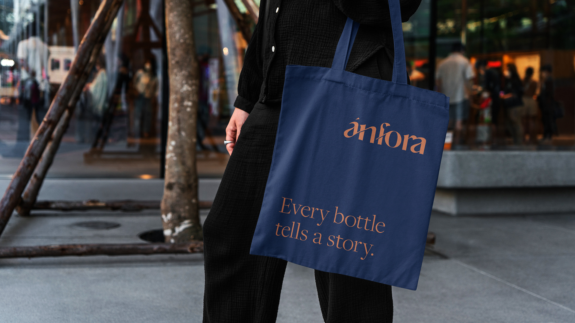
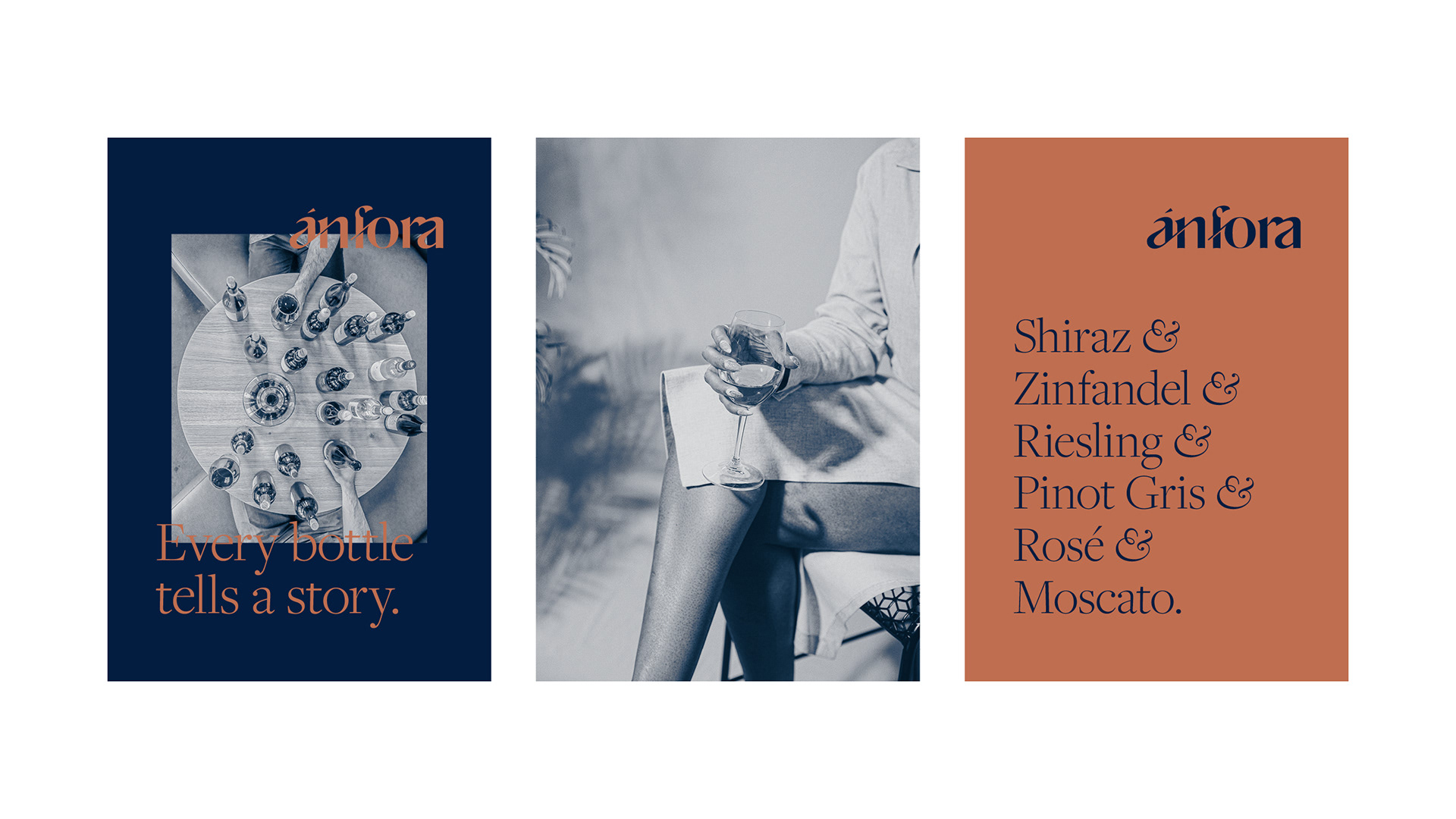
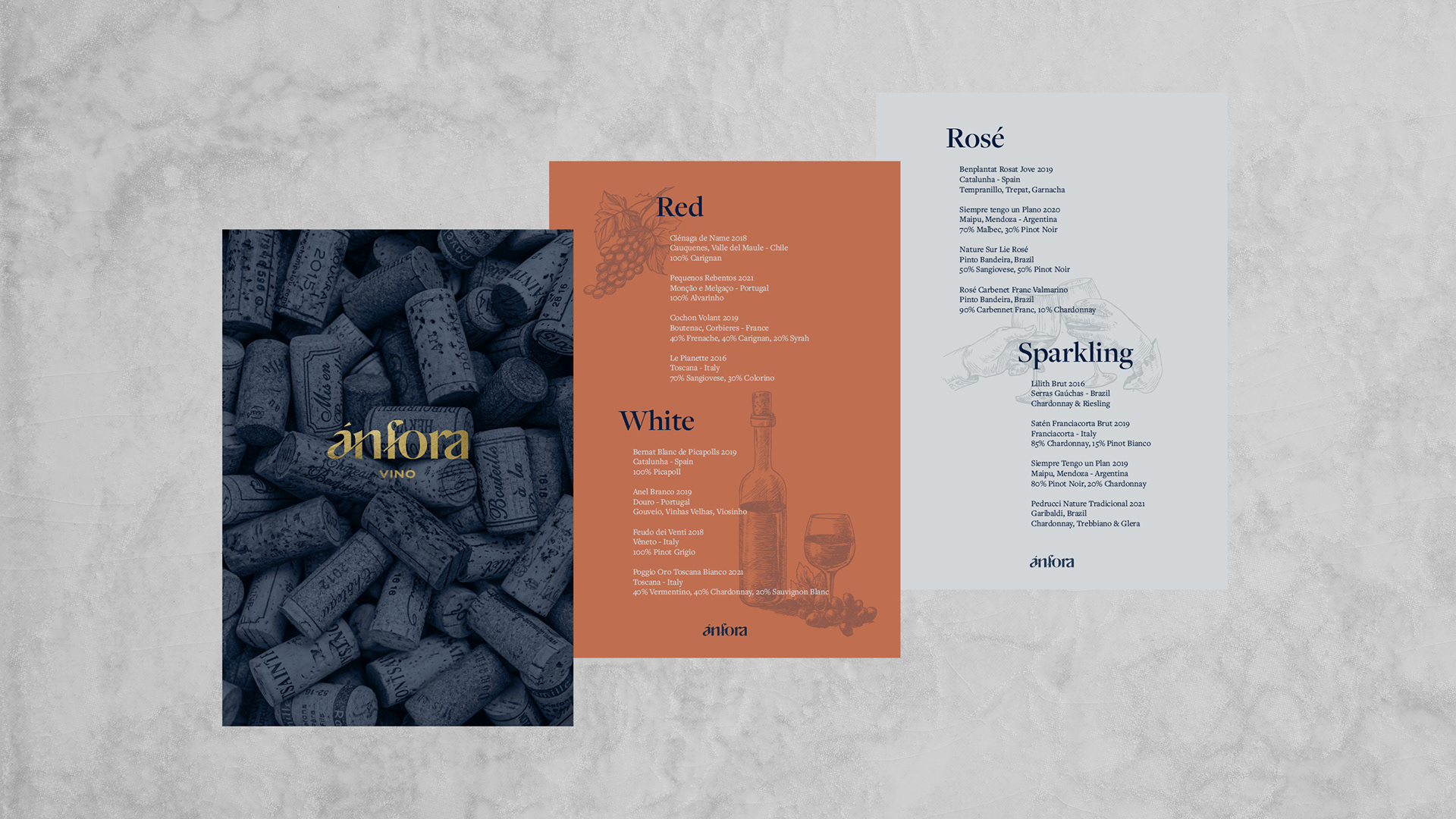
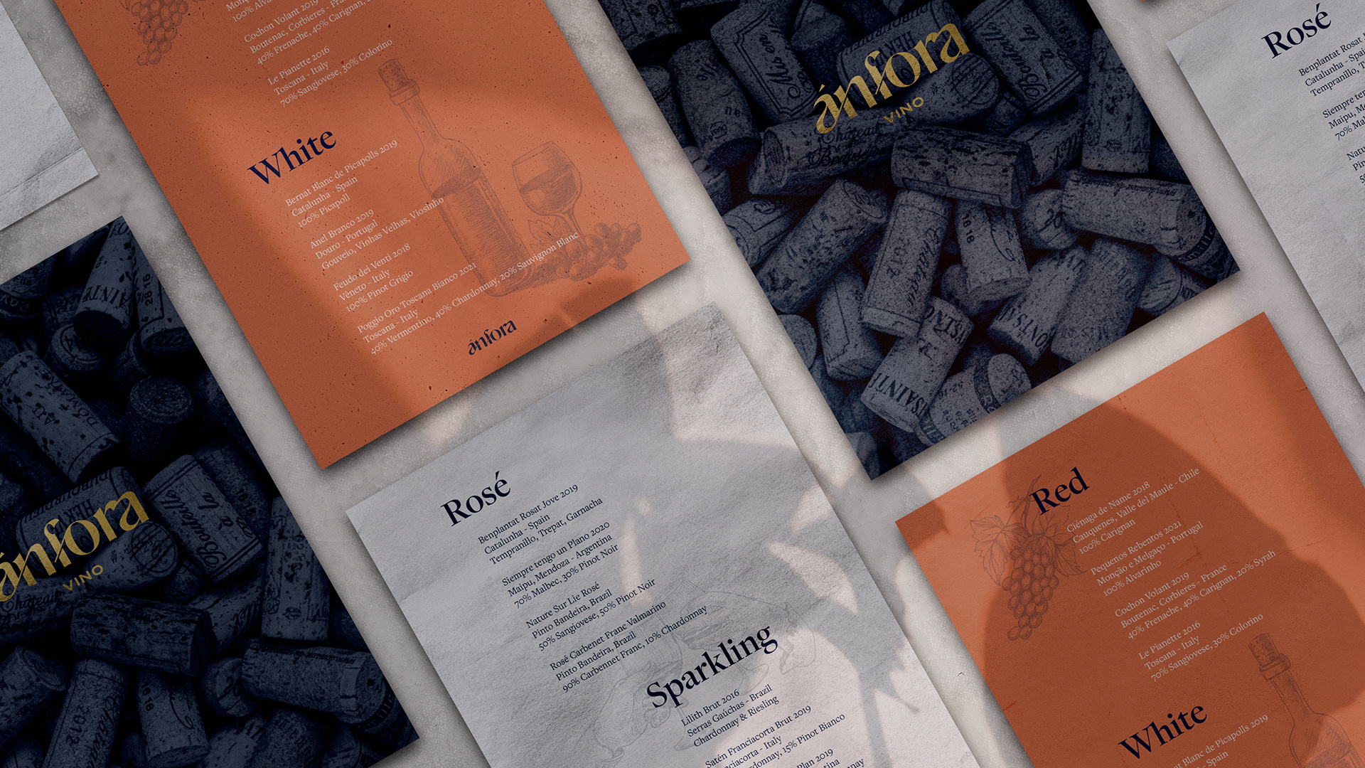
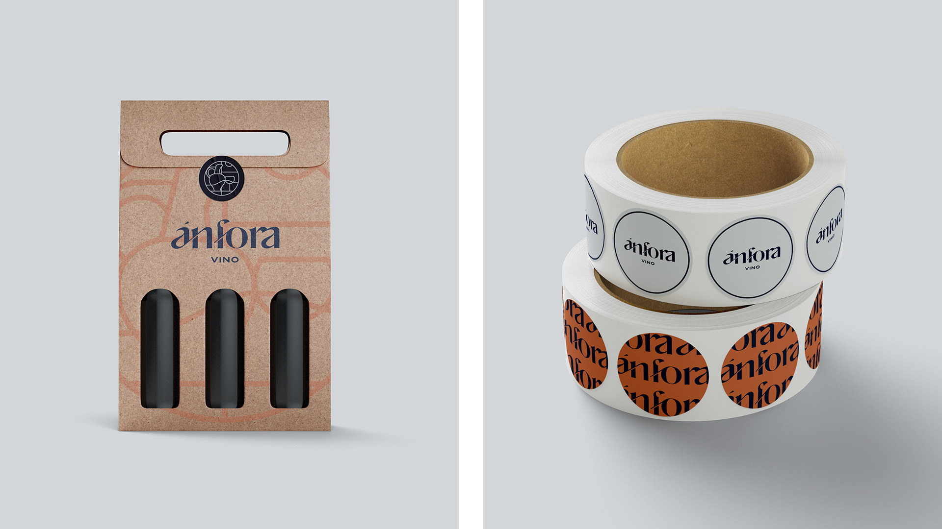
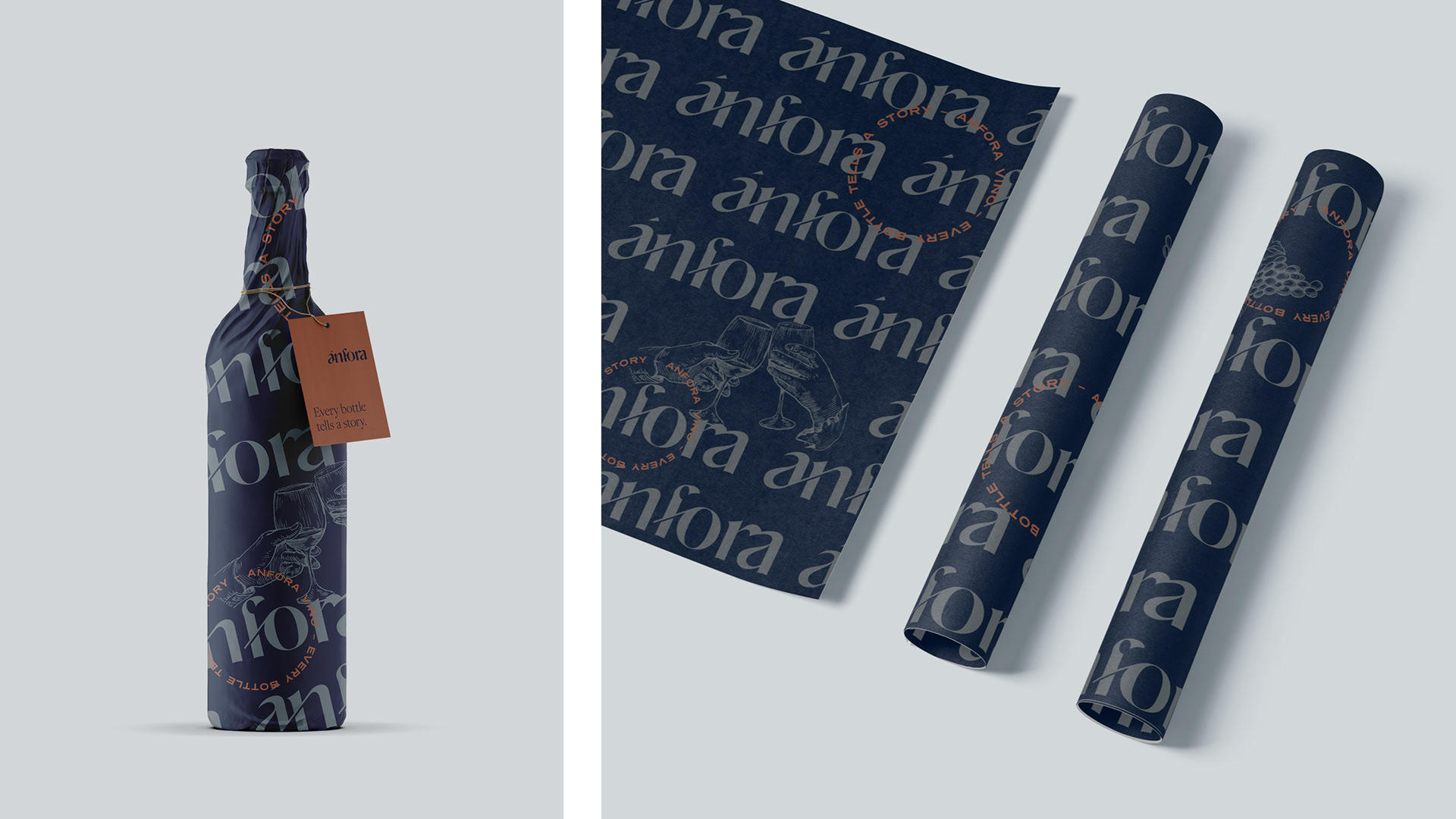
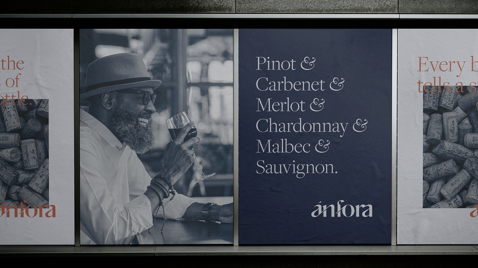
The development of the concept involved building an accessible, bold and modern brand. As a result, cliché elements such as wine glasses, bottles, corkscrews and grape hooks were initially discarded as part of the symbol. Still, they were subtly added to help in the composition of the visual identity.
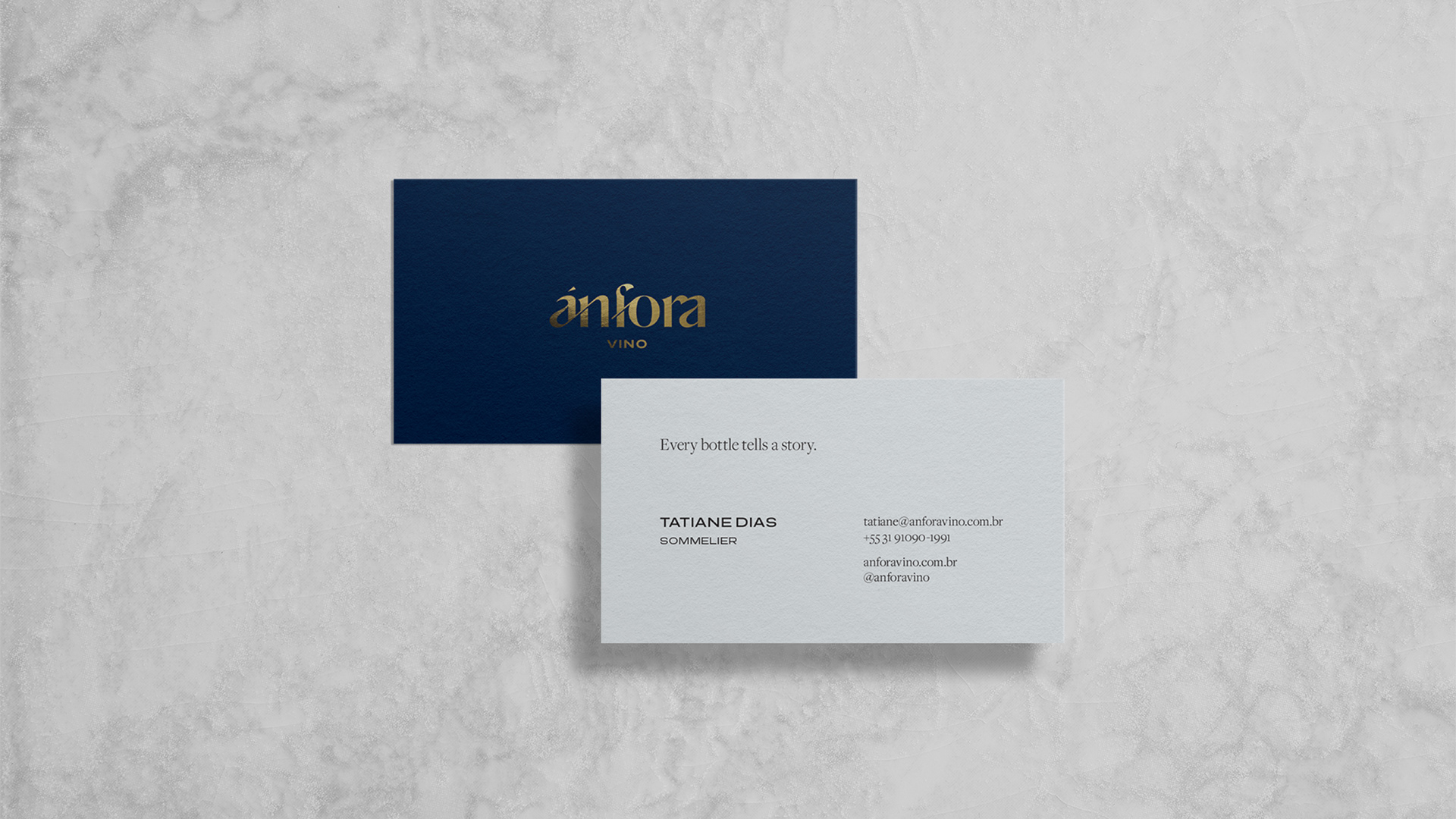
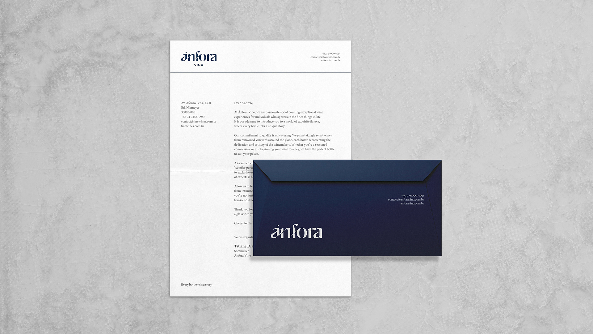
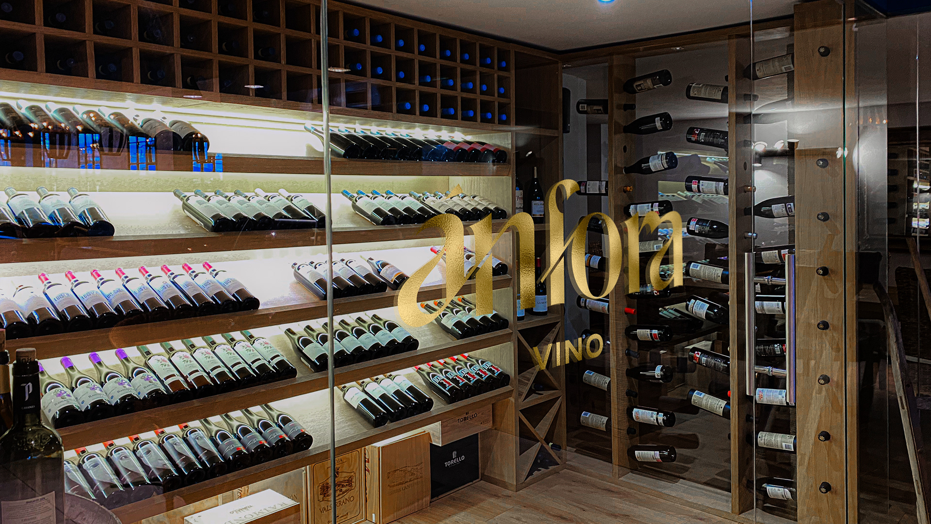
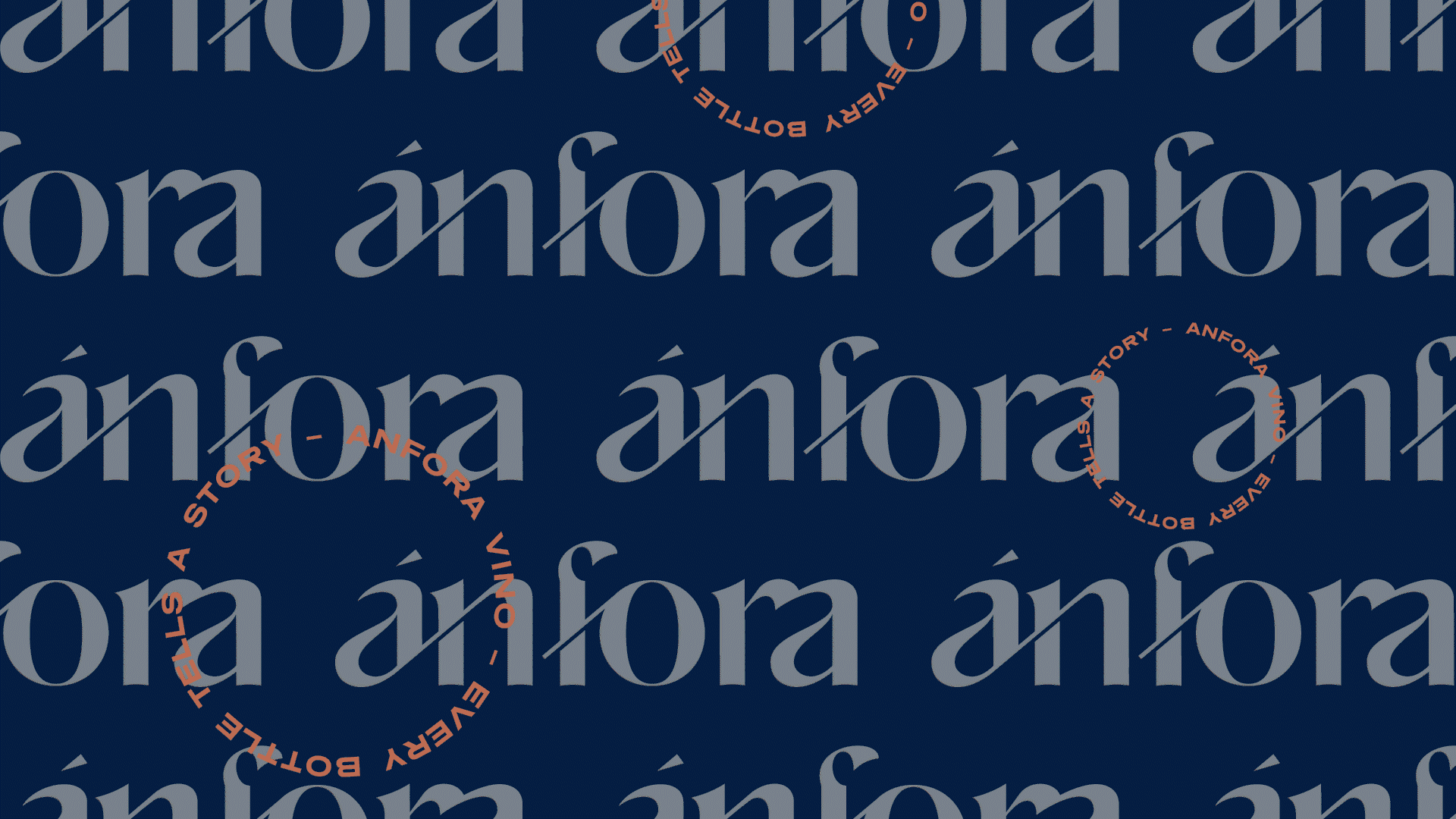
The logotype was based on the Alifira typeface, a beautiful and elegant typography with a mix of thick and thin strokes, bringing romance, sophistication and modernity in just the right measure. The design highlights the wine nuances, flavours and history by exploring the typeface curves and boldness. Furthermore, the combined letter fosters a strong connection between past and present, two relevant factors at Ánfora.
ATTRIBUTES
creative | accessible | bold | modern | romantic
creative | accessible | bold | modern | romantic
SCOPE
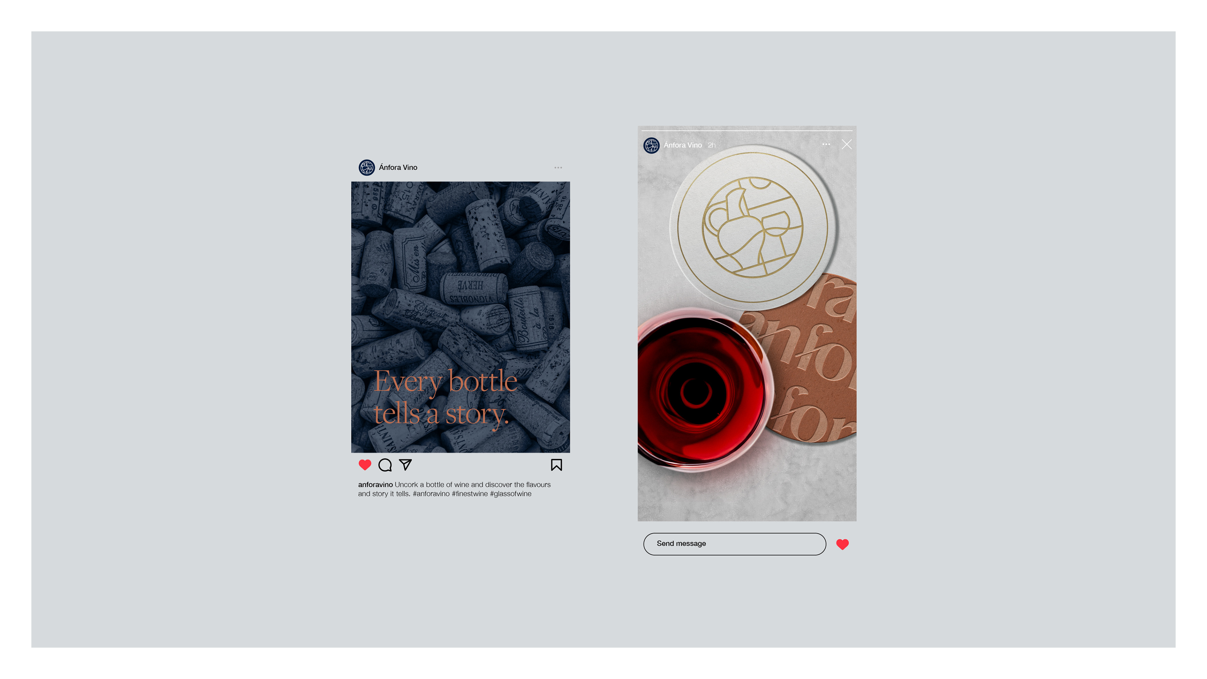
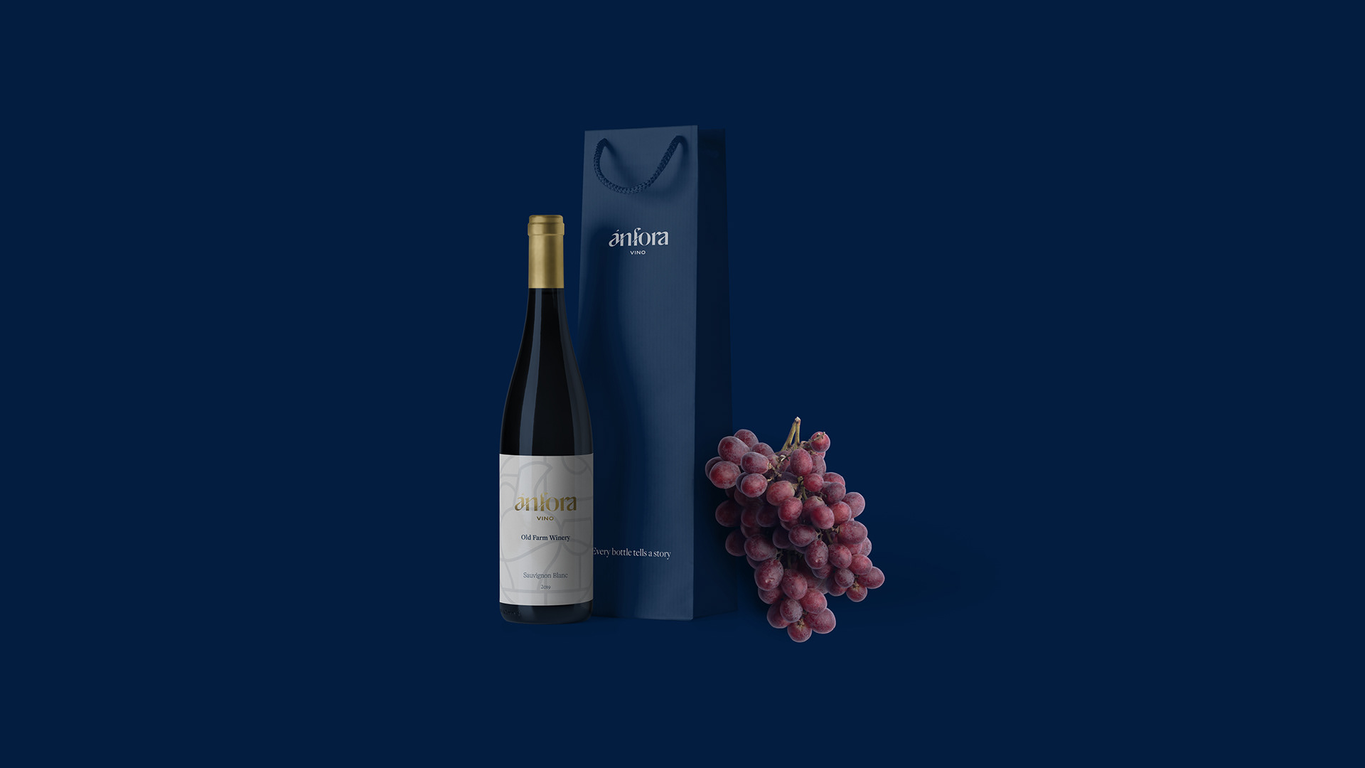
brand identity | brand strategy & positioning | packaging | digital assets
brand identity | brand strategy & positioning | packaging | digital assets